Design Choices - The meaning behind the tangram
Design Choices - The meaning behind the tangram
December 15, 2023

Tangram Theme?
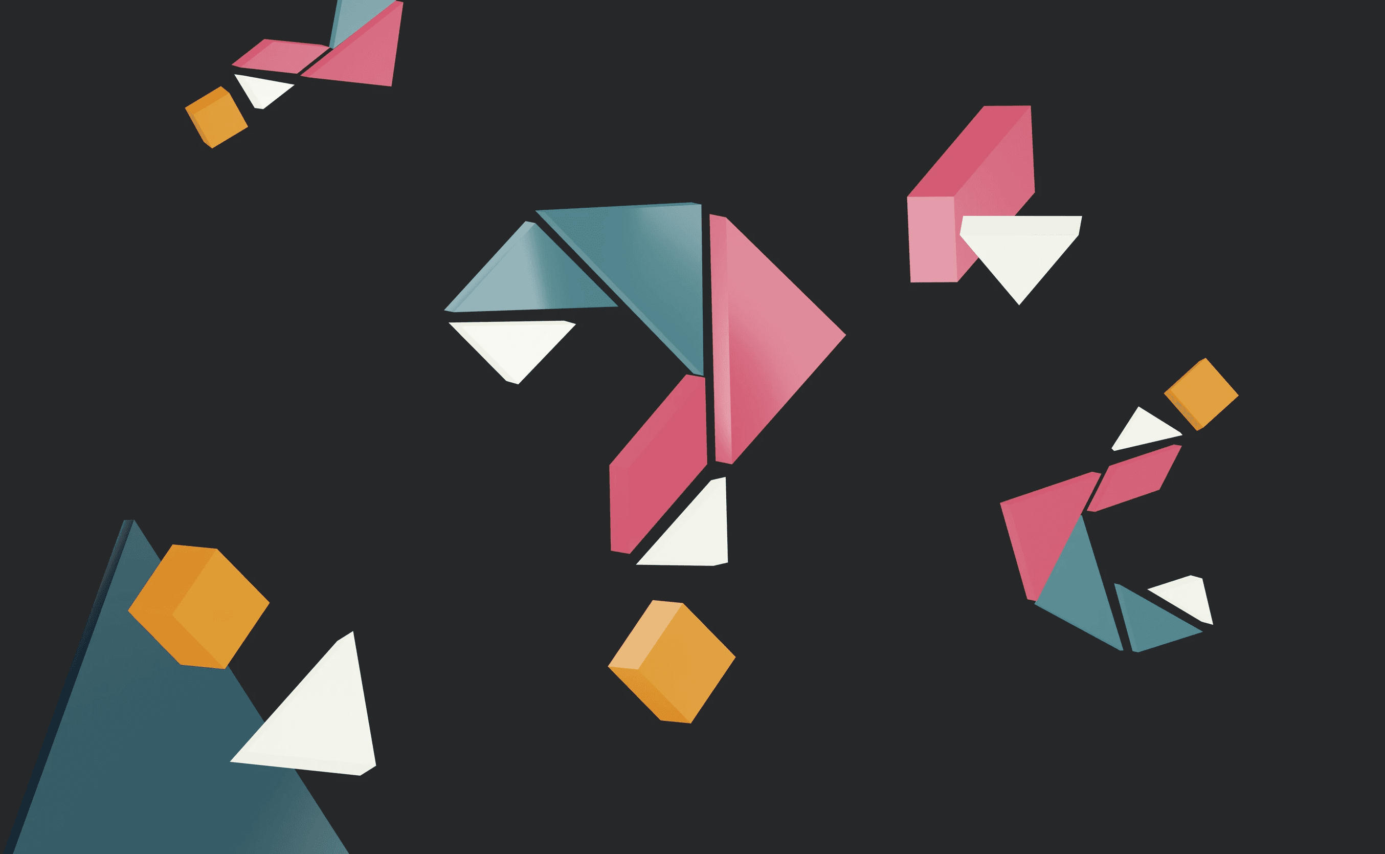
Tangram holds a special place in me, as my most cherished childhood game. Yes, it sounds odd, but let me explain. I have struggled with multiple learning disabilities, especially at my younger ages. Complex games would overwhelm me, while I would find most common board games or physical activities dull. Somehow, the tangram was different. Just seven pieces, endless puzzles. I spend countless hours solving them and even coming up with my own shapes.
I think the principle of a clean minimal pallet, which becomes extremely versatile, when used masterfully, applies really well to design. The tangram is made up of only seven pieces. Seven shapes, even fewer colors. In fact, the number of items a person can keep in their working memory is seven, plus or minus two (Miller’s Law: as referenced in https://lawsofux.com/ by JON YABLONSKI) and memorability is a key principle of a good UI.
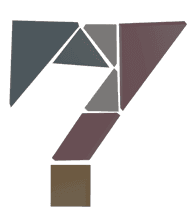
The tangram itself affords great illustrations that can act as the focal point of my website, attracting and intriguing the user. Furthermore, it allowed me to make effective use of metaphors (such as ‘finding the missing piece’ or ‘putting the pieces together’), a reliable technique found in graphic design and marketing in general.
Use of a Persona?
A lot of personal portfolios start with sharing an image of themselves. It makes sense, you want to know who you are working for. It adds a personal touch, especially if a template is being used.
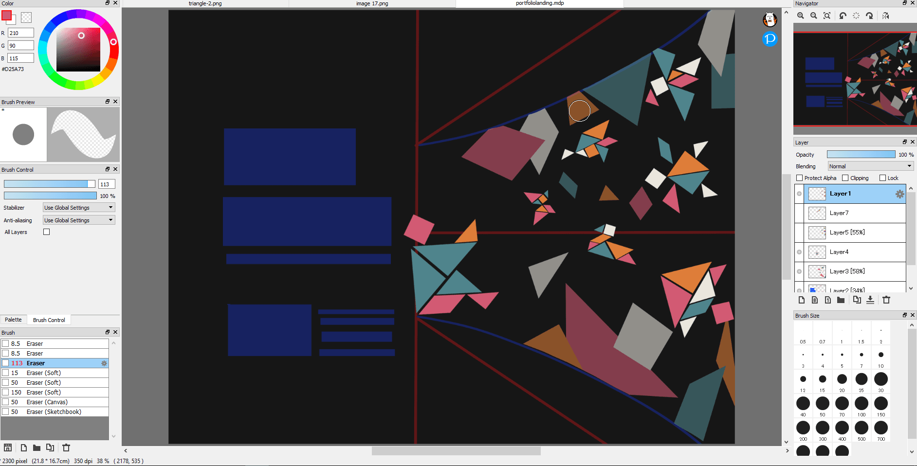
As for me, being more of an introvert, it did not feel genuine to do so. I decided to let the original work paint the picture instead. I used a ‘persona’, made out of the tangram pieces. It is an illustration of myself, holding the laptop, while my designs and ideas are breaking out.
Choice of Patterns?
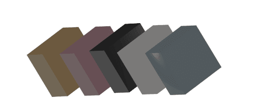
You might have noticed that I avoided vivid colors, opting for a slightly muted pallet. This is because I wanted to show my versatile personality, but not in a loud way. I am an introvert after all.
Not being loud does not equate to not being confident. This is where the use of sharp shapes comes into place. In line with the tangram shapes, buttons, images, and other elements on the page, all maintain an elegant, ‘confident’ status, with clean edges.
As referenced in shape theory, hard edges convey Reliability, Professionalism, and Efficiency. Another example of effective use of shapes is the triangles around the 'connect' visual. Triangles reflect change and action, coupled with the motion effect, which really prompts the user to take action.
Choice of Typography?
My goal with the font choice was to introduce contrast to the traditional and serious ambiance, created by the shapes. It relates back to adding personality to the website and painting a picture.
Contrast is a key principle in design and I enjoy applying it with the use of fonts. It can be quite a challenge to find a contrasting font that results in an aesthetically pleasing and coherent feel.
A modern and contrasting font was crucial here since the target audience is going to be from around the tech world. It is important that they understand I 'can speak their language'. After testing and iterating I decided on Space Grotesk, a well-supported Google Font.
Animations?
Animations can bring a site to life, intrigue the user, and even build a connection through interactivity, as well as contribute to the principle of repetition. Unfortunately, a lot of times animations are an afterthought in design, something slapped at the end to make the page look modern and cool. Other times, they are overused, resulting in confusing and overwhelming UX.
While assessing who the audience of my portfolio is and under what context they are viewing it, it was clear that I needed to immediately captivate them, intrigue them and make them willing to invest more time exploring it. I needed this website to stand out from hundreds of similar ones, make the user almost feel like they are interacting with someone, and really play in on their curiosity, all within less than fifteen seconds.
I knew that animations would be a key factor in achieving that, therefore I treated them the same way as I did with the choice of typography, color pallet, and so on. I set a clear and consistent usage pattern out front and utilized them meaningfully.
A good example is the /kubesim project page. I start the page with a chaotic layout, ( bubbling shapes randomly appearing) and I finish it with the same shapes coming together to showcase the final product. This is to illustrate how I took on an unstructured, general idea and helped the team create a tangible and specific product, through my process of design.
Another example is the slide left and right animation of the core skills on the landing page. I really wanted to showcase how this duality of skills blends together in harmony and allows me to be a better designer.
Even the combination of multiple animations is key and purposeful. For example, combining the scroll color change on the landing page with the triangle that follows you, allows me to change the background color (which is necessary for multiple reasons) while making it clear to the user that they are still on the same website.
The way i approached this project as a whole, was through story telling. The design principles, components and patterns were the means of telling it.
Tangram Theme?
Tangram holds a special place in me, as my most cherished childhood game. Yes, it sounds odd, but let me explain. I have struggled with multiple learning disabilities, especially at my younger ages. Complex games would overwhelm me, while I would find most common board games or physical activities dull. Somehow, the tangram was different. Just seven pieces, endless puzzles. I spend countless hours solving them and even coming up with my own shapes.
I think the principle of a clean minimal pallet, which becomes extremely versatile, when used masterfully, applies really well to design. The tangram is made up of only seven pieces. Seven shapes, even fewer colors. In fact, the number of items a person can keep in their working memory is seven, plus or minus two (Miller’s Law: as referenced in https://lawsofux.com/ by JON YABLONSKI) and memorability is a key principle of a good UI.

The tangram itself affords great illustrations that can act as the focal point of my website, attracting and intriguing the user. Furthermore, it allowed me to make effective use of metaphors (such as ‘finding the missing piece’ or ‘putting the pieces together’), a reliable technique found in graphic design and marketing in general.
Use of a Persona?
A lot of personal portfolios start with sharing an image of themselves. It makes sense, you want to know who you are working for. It adds a personal touch, especially if a template is being used.
As for me, being more of an introvert, it did not feel genuine to do so. I decided to let the original work paint the picture instead. I used a ‘persona’, made out of the tangram pieces. It is an illustration of myself, holding the laptop, while my designs and ideas are breaking out.

Choice of Patterns?

You might have noticed that I avoided vivid colors, opting for a slightly muted pallet. This is because I wanted to show my versatile personality, but not in a loud way. I am an introvert after all.
Not being loud does not equate to not being confident. This is where the use of sharp shapes comes into place. In line with the tangram shapes, buttons, images, and other elements on the page, all maintain an elegant, ‘confident’ status, with clean edges.
As referenced in shape theory, hard edges convey Reliability, Professionalism, and Efficiency. Another example of effective use of shapes is the triangles around the 'connect' visual. Triangles reflect change and action, coupled with the motion effect, which really prompts the user to take action.
Choice of Typography?
My goal with the font choice was to introduce contrast to the traditional and serious ambiance, created by the shapes. It relates back to adding personality to the website and painting a picture.
Contrast is a key principle in design and I enjoy applying it with the use of fonts. It can be quite a challenge to find a contrasting font that results in an aesthetically pleasing and coherent feel.
A modern and contrasting font was crucial here since the target audience is going to be from around the tech world. It is important that they understand I 'can speak their language'. After testing and iterating I decided on Space Grotesk, a well-supported Google Font.
Animations?
Animations can bring a site to life, intrigue the user, and even build a connection through interactivity, as well as contribute to the principle of repetition. Unfortunately, a lot of times animations are an afterthought in design, something slapped at the end to make the page look modern and cool. Other times, they are overused, resulting in confusing and overwhelming UX.
While assessing who the audience of my portfolio is and under what context they are viewing it, it was clear that I needed to immediately captivate them, intrigue them and make them willing to invest more time exploring it. I needed this website to stand out from hundreds of similar ones, make the user almost feel like they are interacting with someone, and really play in on their curiosity, all within less than fifteen seconds.
I knew that animations would be a key factor in achieving that, therefore I treated them the same way as I did with the choice of typography, color pallet, and so on. I set a clear and consistent usage pattern out front and utilized them meaningfully.
A good example is the /kubesim project page. I start the page with a chaotic layout, ( bubbling shapes randomly appearing) and I finish it with the same shapes coming together to showcase the final product. This is to illustrate how I took on an unstructured, general idea and helped the team create a tangible and specific product, through my process of design.
Another example is the slide left and right animation of the core skills on the landing page. I really wanted to showcase how this duality of skills blends together in harmony and allows me to be a better designer.
Even the combination of multiple animations is key and purposeful. For example, combining the scroll color change on the landing page with the triangle that follows you, allows me to change the background color (which is necessary for multiple reasons) while making it clear to the user that they are still on the same website.
The way i approached this project as a whole, was through story telling. The design principles, components and patterns were the means of telling it.
Tangram Theme?
Tangram holds a special place in me, as my most cherished childhood game. Yes, it sounds odd, but let me explain. I have struggled with multiple learning disabilities, especially at my younger ages. Complex games would overwhelm me, while I would find most common board games or physical activities dull. Somehow, the tangram was different. Just seven pieces, endless puzzles. I spend countless hours solving them and even coming up with my own shapes.
I think the principle of a clean minimal pallet, which becomes extremely versatile, when used masterfully, applies really well to design. The tangram is made up of only seven pieces. Seven shapes, even fewer colors. In fact, the number of items a person can keep in their working memory is seven, plus or minus two (Miller’s Law: as referenced in https://lawsofux.com/ by JON YABLONSKI) and memorability is a key principle of a good UI.

The tangram itself affords great illustrations that can act as the focal point of my website, attracting and intriguing the user. Furthermore, it allowed me to make effective use of metaphors (such as ‘finding the missing piece’ or ‘putting the pieces together’), a reliable technique found in graphic design and marketing in general.
Use of a Persona?
A lot of personal portfolios start with sharing an image of themselves. It makes sense, you want to know who you are working for. It adds a personal touch, especially if a template is being used.
As for me, being more of an introvert, it did not feel genuine to do so. I decided to let the original work paint the picture instead. I used a ‘persona’, made out of the tangram pieces. It is an illustration of myself, holding the laptop, while my designs and ideas are breaking out.

Choice of Patterns?

You might have noticed that I avoided vivid colors, opting for a slightly muted pallet. This is because I wanted to show my versatile personality, but not in a loud way. I am an introvert after all.
Not being loud does not equate to not being confident. This is where the use of sharp shapes comes into place. In line with the tangram shapes, buttons, images, and other elements on the page, all maintain an elegant, ‘confident’ status, with clean edges.
As referenced in shape theory, hard edges convey Reliability, Professionalism, and Efficiency. Another example of effective use of shapes is the triangles around the 'connect' visual. Triangles reflect change and action, coupled with the motion effect, which really prompts the user to take action.
Choice of Typography?
My goal with the font choice was to introduce contrast to the traditional and serious ambiance, created by the shapes. It relates back to adding personality to the website and painting a picture.
Contrast is a key principle in design and I enjoy applying it with the use of fonts. It can be quite a challenge to find a contrasting font that results in an aesthetically pleasing and coherent feel.
A modern and contrasting font was crucial here since the target audience is going to be from around the tech world. It is important that they understand I 'can speak their language'. After testing and iterating I decided on Space Grotesk, a well-supported Google Font.
Animations?
Animations can bring a site to life, intrigue the user, and even build a connection through interactivity, as well as contribute to the principle of repetition. Unfortunately, a lot of times animations are an afterthought in design, something slapped at the end to make the page look modern and cool. Other times, they are overused, resulting in confusing and overwhelming UX.
While assessing who the audience of my portfolio is and under what context they are viewing it, it was clear that I needed to immediately captivate them, intrigue them and make them willing to invest more time exploring it. I needed this website to stand out from hundreds of similar ones, make the user almost feel like they are interacting with someone, and really play in on their curiosity, all within less than fifteen seconds.
I knew that animations would be a key factor in achieving that, therefore I treated them the same way as I did with the choice of typography, color pallet, and so on. I set a clear and consistent usage pattern out front and utilized them meaningfully.
A good example is the /kubesim project page. I start the page with a chaotic layout, ( bubbling shapes randomly appearing) and I finish it with the same shapes coming together to showcase the final product. This is to illustrate how I took on an unstructured, general idea and helped the team create a tangible and specific product, through my process of design.
Another example is the slide left and right animation of the core skills on the landing page. I really wanted to showcase how this duality of skills blends together in harmony and allows me to be a better designer.
Even the combination of multiple animations is key and purposeful. For example, combining the scroll color change on the landing page with the triangle that follows you, allows me to change the background color (which is necessary for multiple reasons) while making it clear to the user that they are still on the same website.